POPULAR CHART INDICATORS
The MACD Indicator
MACD is an acronym for Moving Average Convergence Divergence.
This indicator is a tool that’s used to identify moving averages that are indicating a new trend, whether it’s bullish or bearish.
After all, our top priority in trading is being able to find a trend, because that is where the most money is made.
With a MACD chart, you will usually see three numbers that are used for its settings.
The first is the number of periods that is used to calculate the faster-moving average.
The second is the number of periods that is used in the slower moving average.
And the third is the number of bars that is used to calculate the moving average of the difference between the faster and slower moving averages.
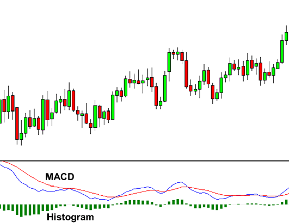
Because there are two moving averages with different “speeds”, the faster one will obviously be quicker to react to price movement than the slower one.
When a new trend occurs, the fast line will react first and eventually cross the slower line.
When this “crossover” occurs, and the fast line starts to “diverge” or move away from the slower line, it often indicates that a new trend has formed.
TRADING USING MACD
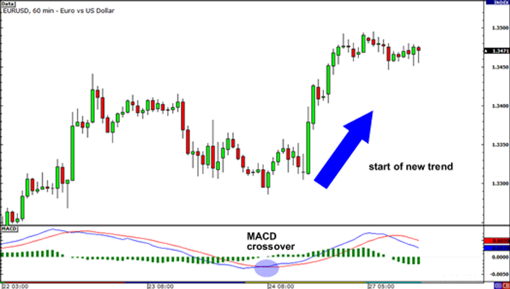
Let’s take a look at an example.
In EUR/USD’s 1-hour chart below, the fast line crossed above the slow line while the histogram disappeared. This suggested that the brief downtrend could potentially reverse.
From then, EUR/USD began shooting up as it started a new uptrend. Imagine if you went long after the crossover, you would’ve gained almost 200 pips!
There is one drawback to MACD.
Naturally, moving averages tend to lag behind price.
After all, it’s just an average of historical prices.
Since the MACD represents moving averages of other moving averages and is smoothed out by another moving average, you can imagine that there is quite a bit of lag. However, MACD is still one of the most favored tools by many traders.
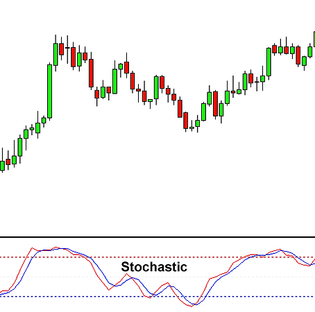
Stochastic Oscillator Indicator
The Stochastic oscillator is another technical indicator that helps traders determine where a trend might be ending.
The oscillator works on the following theory:
During an uptrend, prices will remain equal to or above the previous period closing price.
During a downtrend, prices will likely remain equal to or below the previous closing price.
The Stochastic oscillator uses a scale to measure the degree of change between prices from one closing period to predict the continuation of the current direction trend.
The 2 lines are similar to the MACD lines in the sense that one line is faster than the other.
The Stochastic tells us when the market is overbought or oversold. The Stochastic is scaled from 0 to 100.
When the Stochastic lines are above 80 (the red dotted line in the chart above), then it means the market is overbought.
When the Stochastic lines are below 20 (the blue dotted line), then it means that the market is oversold.
As a rule of thumb, we buy when the market is oversold, and we sell when the market is overbought.
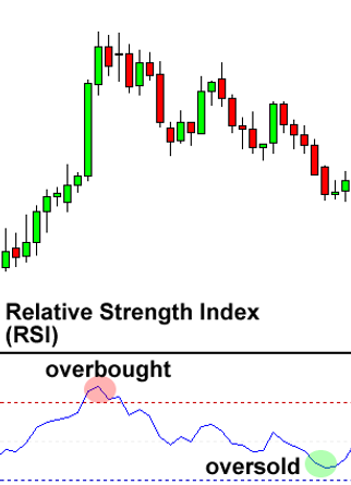
Relative Strength Index (RSI)
Relative Strength Index, or RSI, is a popular indicator developed by a technical analyst named J. Welles Wilder, that help traders evaluate the strength of the current market.
RSI is similar to Stochastic in that it identifies overbought and oversold conditions in the market.
It is also scaled from 0 to 100.
Typically, readings of 30 or lower indicate oversold market conditions and an increase in the possibility of price strengthening (going up).
Some traders interpret that an oversold currency pair is an indication that the falling trend is likely to reverse, which means it’s an opportunity to buy.
Readings of 70 or higher indicate overbought conditions and an increase in the possibility of price weakening (going down).
Some traders interpret that an overbought currency pair is an indication that the rising trend is likely to reverse, which means it’s an opportunity to sell.
In addition to the overbought and oversold indicators mentioned above, traders who use the Relative Strength Index (RSI) indicator also look for centerline crossovers.
A movement from below the centerline (50) to above indicates a rising trend.
A rising centerline crossover occurs when the RSI value crosses ABOVE the 50 line on the scale, moving towards the 70 line. This indicates the market trend is increasing in strength, and is seen as a bullish signal until the RSI approaches the 70 line.
A movement from above the centerline (50) to below indicates a falling trend.
A falling centerline crossover occurs when the RSI value crosses BELOW the 50 line on the scale, moving towards the 30 line. This indicates the market trend is weakening in strength, and is seen as a bearish signal until the RSI approaches the 30 line.